SEO Optimization Tool (Yoast SEO)
To optimize SEO performance of your site, we recommend you to use Yoast SEO plugin, which is compatible with theme. To activate plugin, go to Plugins, search for WordPress SEO by Yoast and click activate. You will find the Yoast control section in the post or page admin page.
For post, Yoast SEO plugin will automatically detect the content in the WordPress classic editor itself, which means all the content can be analyzed by Yoast SEO plugin, However, for page which created from Blueprint, not all the content can be analyzed by plugin. Here are the elements which can’t be analyzed
Blog, Featured Post, Plugin Slider, Custom Post Type, Product, Product Category, HTML, Related Post, Portfolio, Blueprint block, contact form, widgets
One Page
You can create unique one page scroll among many pages of the site by creating unique menu just to use in that page. To create one page scroll, there are a few steps you have to follow.
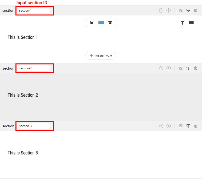
Step 1 Create page with multiple sections : make sure page you are creating is not in Full / Half Slide Page mode by clicking Page on Blueprint Menu bar and turn off both Full / Half Slide Page options. In every section you want to navigate, input the ID of the section like in screenshot (section-1, section-2, section-3). Note section ID must not contain any spacing (ex. “section 1” is unavailable ID).
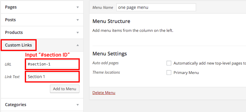
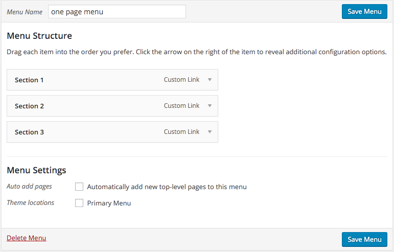
Step 2 Create navigation menu : create menu to navigate to section you created from step 1. Choose Custom Links and input “#” follow by section ID in URL text input field, then input the name of that menu in Link Text. Don’t forget to save menu before close the page.
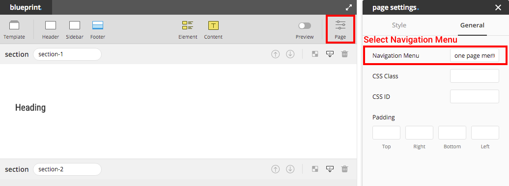
Step 3 Select navigation menu : in case navigation menu you created in step 2 is the primary menu then you can skip this step. If it’s not, then select the menu created in step 2 from inspector of Page Setting on Blueprint menu bar.
Tip : from Blueprint, you can create button / image / text with a link navigate to section you want by adding “#section-id” as a URL of the link.
Beside from navigate to section, user can also similarly navigate to element. By input ID in the field CSS ID of element (in general tab in element inspector), and input the link to navigate to that ID.
Full Slide Page
In this mode page title, footer and sidebar will not be displayed on pc. All the sections in this mode will be automatically adjusted height fit to screen height without turning on the option Fit Screen Height in section inspector. Here are a few steps to create Full Slide Page.
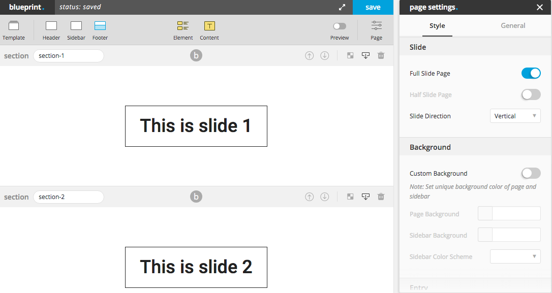
Step 1 Turn Full Slide Page Mode On : click Page Setting on Blueprint menu bar and turn on the switch “Full Slide Page”. Select the direction (vertical/horizontal) of the slide you want.
Step 2 Create Multiple Sections : one slide in Full Slide Page represented by one section. All the sections will be automatically adjusted height fit to screen height. In the below screenshot, there will be 3 slides of this page.
Step 3 Create Navigation Menu : this is similar to creating navigation menu for onepage. Input section ID and create menu to link to that ID using link “#section-id”.
Tip: try not to add too many elements in one section in this mode, the section might not have enough space to display all the elements inside since maximum height of the section is the screen height.
Split Slide Page
Similar with Full Slide Page, page title footer and sidebar will won’t be displayed. Creating split slide page is not much different with creating full slide page. Here are the steps to create split slide page.
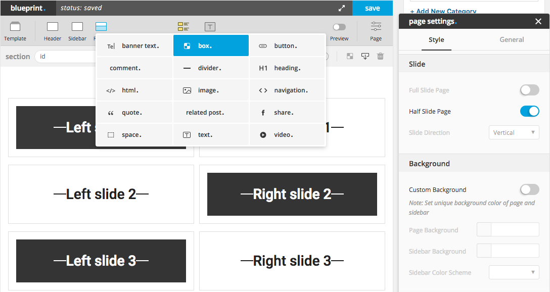
Step 1 Turn Half Slide Page Mode On : click Page Setting on Blueprint menu-bar and turn on the switch “Half Slide Page”.
Step 2 Create A Section and A Row : in this mode, there must be only one section and one row with 2 columns.
Step 3 Create Box Element : drag and drop box in to the columns provided from step 2. In both left and right side must have same amount of box element.
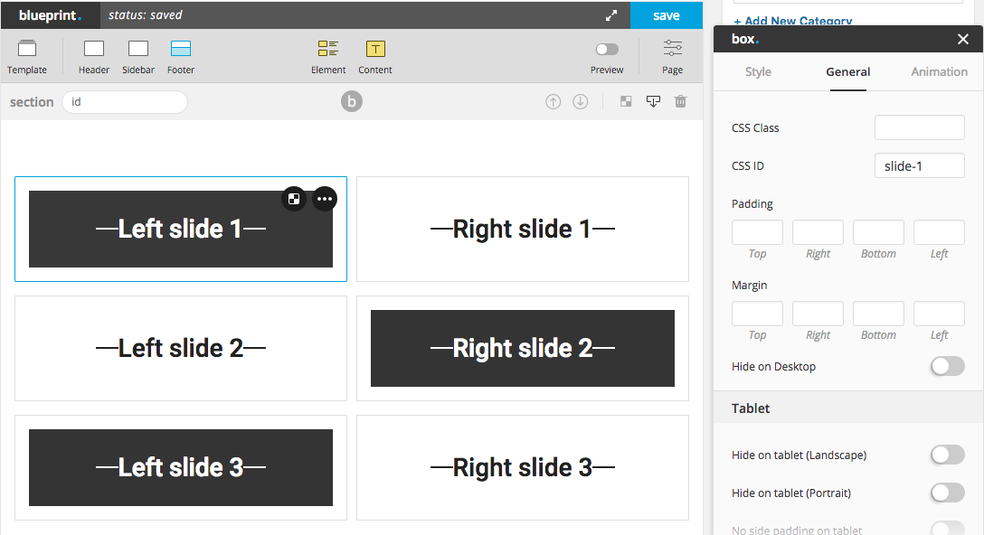
Step 4 Create Navigation Menu : this step will be a bit different with creating navigation menu for full page. Instead of using section id, split slide page require using box id. On the left or right column (choose one) input all CSS ID to each box element and use those ID to create navigation menu in Appearance > Menu. Finally choose menu in page-settings to the menu you’ve just created.
Important Notice : leave box’s height blank, otherwise slide’s height would be distorted. Parallax background of box won’t be able to apply with half slide page, set parallax speed to 0 to prevent some display errors.
Box Element
“Box” is the most advance element among all. You can put almost every element (besides “modal, accordion, interactive and tab”) inside the box, which mean you can set the background to almost every element. Box comes with height, overflow, border, background, vertical align options and etc. You can create unlimited possibilities from these options with element or content inside the box.
2 advance options, Pinned With Item ID and Equal Height Group, inside Advance section of inspector, will help you create equal height box and pinned box. Below are the explanation of how to apply these 2 options.
Pinned Box
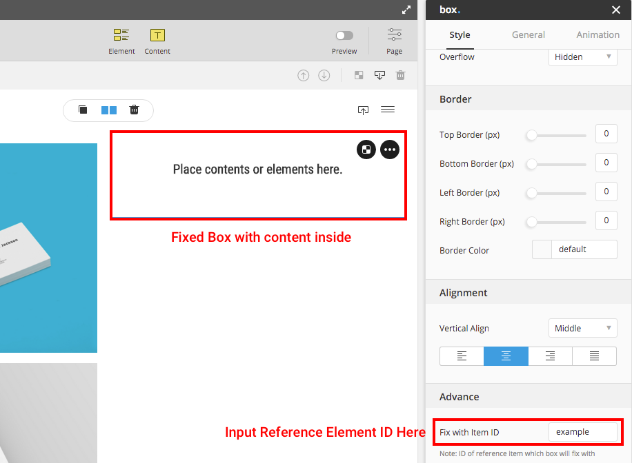
Pinned box is sticked to its parent while scrolling. It helps emphasizing the important content or makes better user experience. It is handy to make a space for banner ads as well.
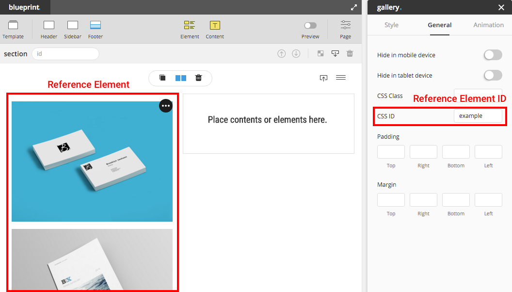
Step 1 Create an element as a parent (reference element) on one column.
Step 2 Input the CSS ID to the parent element.
Step 3 Create a box element that would be pinned to the parent on the other column in the same row.
Step 4 Input the parent ID to the pinned box field “Fix with Item ID” option.
Note : Pinned box height must be shorter than its parent in order to make it work properly.
Equal Height Box
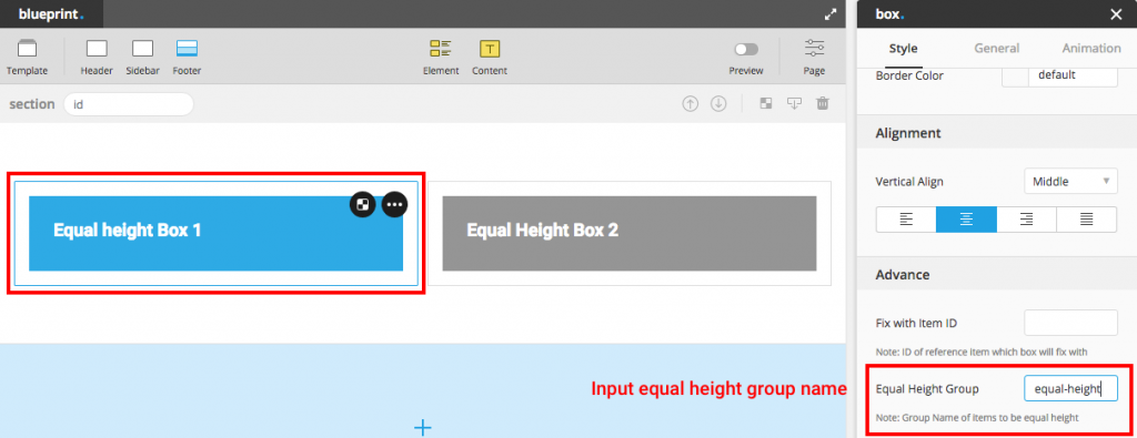
Equal-height box makes the layout flexible on the vertical direction especially when you use one as an image background. To create the equal height boxes, follow these steps.
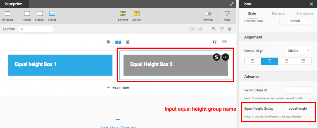
Step 1 Place the boxes in the same row. Input the group name to each box that you want to make them equal height. Boxes which have the same group name will have equal height regardless of how many boxes in the particular row.
Step 2 Drag elements into those boxes.
Step 3 Change background of each box for better equal-height visualization.
Note : Equal Height option is disabled in mobile, so you’d better not leaving any box empty for better mobile experience.
Masonry Various Size (Metro)
If you don’t know what masonry various size look like, here is the demo, some call this layout “Metro”. You can create this kind of layout with the following elements, Blog, Portfolio, Custom Post and Gallery.
Blog / Custom Post Type / Portfolio
There are 2 conditions to create masonry various size layout, Masonry layout with Mouseover Content (overlay style). For portfolio/blog/custom post type element created from Blueprint you can find options to create these 2 conditions in the portfolio/blog element inspector. For portfolio/blog archive page, you can find options in in Customizer > Portfolio and Customizer > Blog
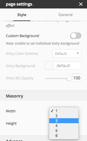
To set width and height of each entry, go to Single Post/Page admin page and open Page Settings (must activate blueprint to see the page-settings). You will find options Width and Height in the section Masonry at the bottom of the inspector. Choose your desired width and height, or choose “1” for default. For example, if you choose width “2”, the entry of editing post in blog element or blog archive will have width 2 times of the normal column width you set. If you want to use WordPress classic editor for that post, after change masonry width or height already, you can turn back to classic editor mode.
Note : “Height” will only take effect when image ratio of portfolio/blog element or archive portfolio/blog is not “original”
Gallery
Making Gallery Masonry is very simple, drag element gallery in to place in anywhere you want. Change the style to “Masonry” and set other options as you desire.
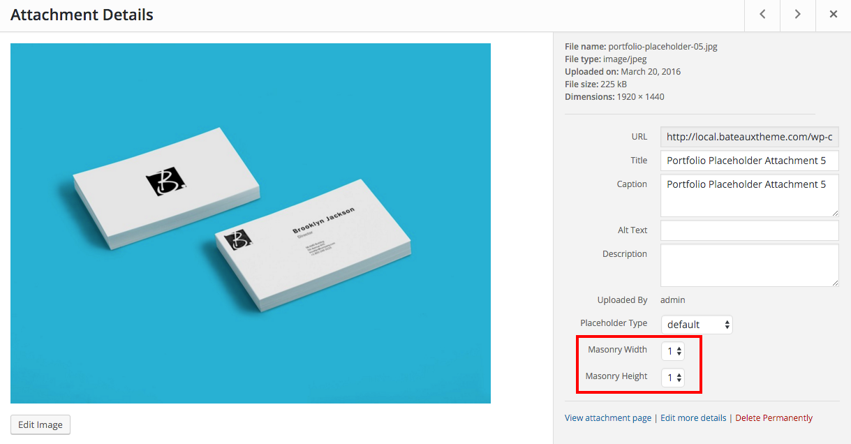
Next step to set the width and height of each image, go to admin panel Media and choose attachment you will find options Masonry Width and Masonry Height. Set width and height as you want, or choose “1” for default.
Note : “Masonry Height” will only take effect when image ratio of gallery is not “original”.
Alternate Link
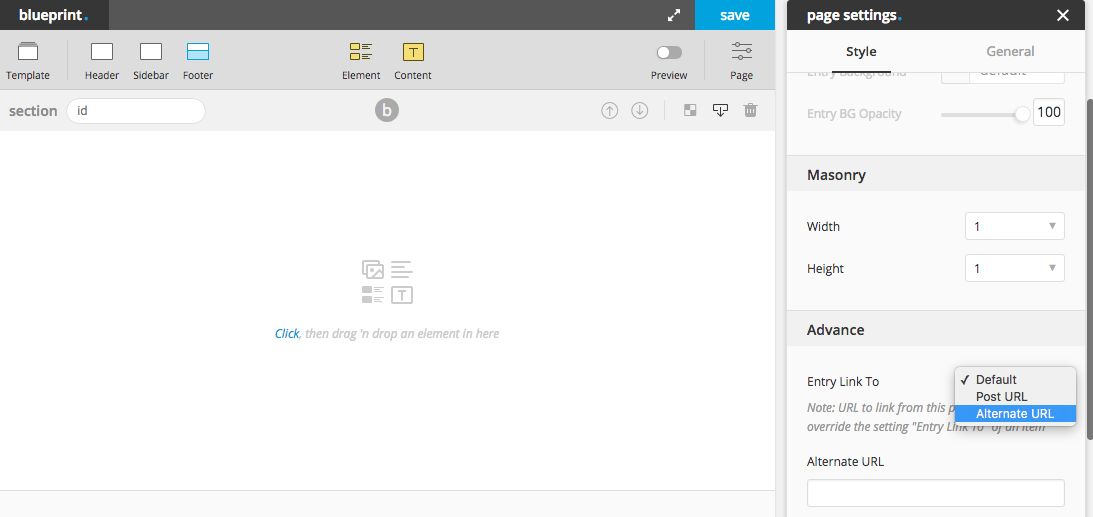
You can choose whether to link blog/portfolio/custom post type entry to single post or alternate link that you have input to that post. To define alternate link, please click on “blueprint” to activate blueprint mode, and click “page” button on blueprint menu. It will popup page-settings of that post, in page settings inspector, scroll down to the bottom and you will see a field to input alternate link. To force that post entry to always link to alternate url, you can select “link to” option to “alternate url”
Instagram Widget
For Instagram widget, there is one required field Access Token need to be inputted. Here are the steps to get Access Token.
Step 1 : Go to this url and click “Register Your Application”
Step 2 : Click “Register a New Client” button.
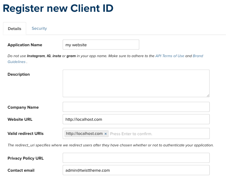
Step 3 : At the details section, fill the Application Name / Website URL / Valid redirect URIs and Contact email.
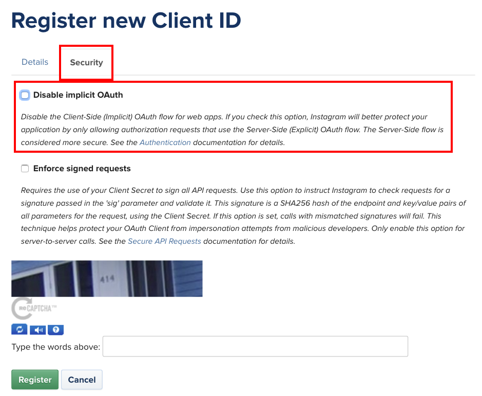
Step 4 : In security section, deselect the “Disable implicit OAuth” option and click register.
Step 5 : Replace the CLIENT_ID and REDIRECT_URL in the below link with the one you registered and click “Authorize” button.
https://api.instagram.com/oauth/authorize/?client_id=CLIENT_ID&redirect_uri=REDIRECT_URL&response_type=token&scope=public_content
Step 6 : After click the authorize button, your browser will be redirect to the url with access token.
http://localhost.com/xampp/splash.php#access_token=xxxxxxxxxxxxxxxxxxxxx
You can copy Access Token out to use with instagram widget.
Reference: https://www.instagram.com/developer/authentication/
Modal / Pop up
Embed Modal
User can create modal with embed media inside which will popup after click on trigger. This type of modal doesn’t require “modal” element at all. Supported media embed are image, video (.mp4 self hosted, youtube, vimeo), google map and audio (soundcloud, mixcloud).
By simply input URL “#embed({URL OF MEDIA SOURCE})” to the trigger (button, image, text or any element where user can input link), for example “#embed(https://www.youtube.com/watch?v=AmC9SmCBUj4)”.
Content Modal
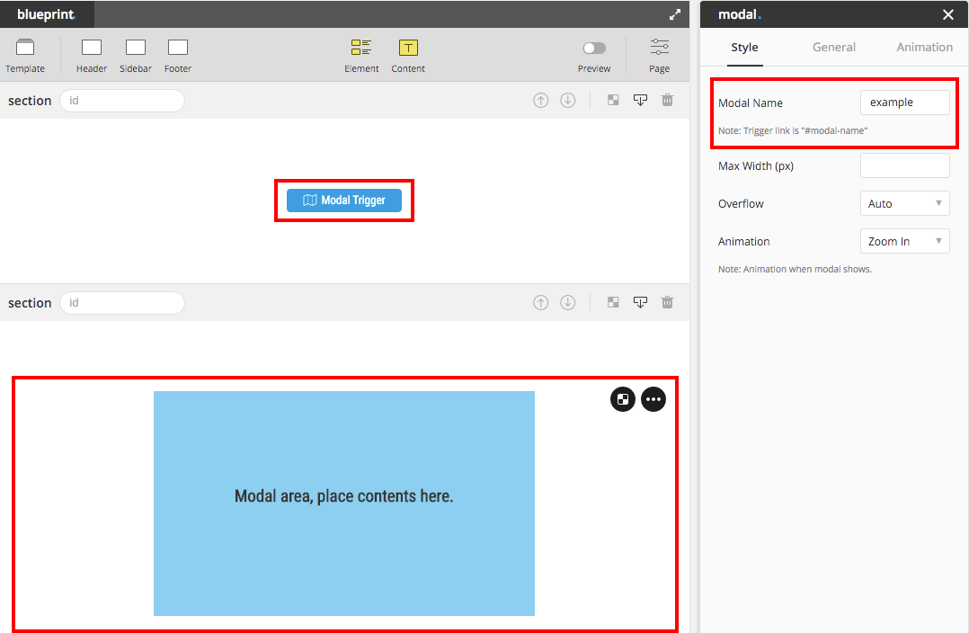
To create content modal is a bit different from embed modal above. There must be 2 components to create this type of modal, modal element and modal trigger.
Modal Element : is an area to place the contents or elements inside. To create modal box, simply drag and drop Modal to the place you want and name to modal (modal’s name must not contain any spacing). Tip : Since modal is a light box that you don’t have to care about location, we suggest you to drop modal box in anywhere that doesn’t effect other contents’ position in Blueprint, for example at the last section last row.
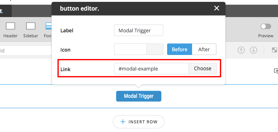
Modal Trigger : can be in any form, image/icon/text/button. Modal Box will popup after click the Trigger. To create the trigger, simply add link name as “#modal-{modal’s name}” into the link input field.
Splash Screen
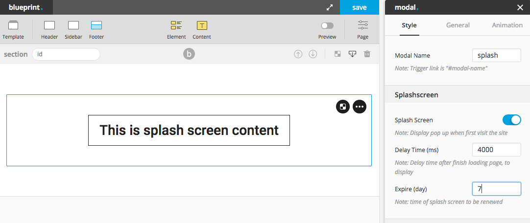
Splash Screen is a modal that will popup when user first visit the page which has that modal. User can use this type of modal to create subscription box for the first visit visitor or create occasional event popup to drive the event or announce special event or promotion. User can set the expiration of the splash screen and also the delay time (after page load) until the modal display.
Visitor who already visited the site won’t be able to see the same splash screen again unless they change the browser to open the page or time exceed the setting expiration time of that modal.
To create splash screen, simply use “modal” element and check an option “Splash Screen”, define modal name (required), delay tim and expire (day). User can also create a trigger of the modal by create the same trigger as “content modal“.
Important Notice : theme uses cookies to store the session of splash screen. In some countries which law requires site to inform visitor that site use cookies, theme provides notification box (using cookies term and condition agreement notify box) which user can enable or set it in Appearance > Customize > Design > Cookies section.
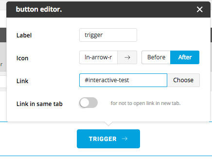
Interactive Trigger
Interactive element, you can choose whether to hover or click to show the hidden state. To create “click” action to trigger interactive element, please follow the below instruction.
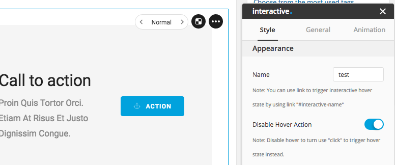
Step 1 : Disable Hover Action (optional), you can choose to disable hover action to prevent conflict of usage or to prevent visitor from getting confuse.
Step 2 : Input the name of interactive, name the interactive to any name you want.
Step 3Create trigger, create the link from any element button, image, text or etc. with the URL “#interactive-{name}” {name} represent the name you input in the 2nd step.
Deep Link
By adding the following hash behind the url, user will be able to open the deep link of the elements in the specify index.
- modal : #modal-{name}
- interactive : #interactive-{name}
- tab : #tab-{name}-{index} (index start from 1)
- accordion : #accordion-{name}-{index} (index start from 1)
- slider : #slider-{name}-{index} (index start from 1)
- blog/portfolio/custom post/product : #entries-{name}-{filter-name} (this will apply with any element which has filter)
Example of how to use deep link : www.twisttheme.com/#modal-test, www.twsittheme.com/#entries-test-filter1
Product variation control
Theme provide option for user to switch from normal select control to image radio control. Customize > WooCommerce > Product and find the option “variation mode” that will be where you can set the variation control for your product variation.
In product > attributes menu user can create product attribute freely. User will be able to use image to display as an option for variation, recommended size of image 80×80 px. In case no image uploaded, radio control will use the name of attribute value instead of image.
There is one special slug of attribute which won’t have image upload field, “color”. For the slug “color” or “colour” attribute, user will see the color picker instead of image upload control. Using filter “color_field_apply_attribute” can help you add more product attribute which support color picker.
Set page to start from top
Theme will automatically add padding on the top of the page by default, in case user is not using transparent navigation bar. To get rid of padding on top. User can set the content of the page to start from top (0,0) without padding by open “page settings”, clicking “page” in blueprint menu and navigate to general tab. Add “0” to padding-top field to disable the auto padding space on the top of the page.
Adding blueprint to custom post type
To add custom post type, user is required to activate child theme. In function.php file in child theme folder, there is a function name “child_theme_support_blueprint” where user can uncomment the function and replace “xxxx” with the custom post type name.
Adding rating to comment of custom post type
To add rating to comment of the custom post type, user is required to activate child theme. In function.php file in child theme folder, there is a function name “child_theme_support_rating” where user can uncomment the function and replace “xxxx” with the custom post type name.
Adding poll (like/dislike) to comment of custom post type
To add poll (like/dislike) to comment of the custom post type, user is required to activate child theme. In function.php file in child theme folder, there is a function name “child_theme_support_comment_like” where user can uncomment the function and replace “xxxx” with the custom post type name.
Changing order of social icons
To change the order of social icons, user is required to activate child theme. User can change the order of array in function “child_theme_social_order” in file “function.php” in child theme folder.
Translation
We provide the translation file in the theme. In order to translate the theme, you need to use Poedit app. You can download it here. Then, follow these steps.
Step 1 – Go to theme folder > languages and open {theme name}.pot in Poedit app
Step 2 – Click Create New Translation at the bottom and select your language
Step 3 – Enter translation to the words you would like to translate.
Step 4 – When finished, go to ‘File > Compile to MO’ and save as .mo and .po
Step 5 – rename the .mo/.po file to {theme name}-fr_FR.mo and {theme name}-fr_FR.po respectively and put it in wp-content/languages/themes directory on the server
If user is not sure about the suffix that should put in your translated file name “fr_FR”, you can go to Theme Dashboard > System Status and find “language“, user will be able to get the suffix from there.
Note : You can edit your .po file anytime, so you may not have to translate all the words at once. Do not forget to compile to .mo file whenever you make the change.
Additional Custom Fields
Recipe Additional Custom Fields
Below are additional 4 custom fields that can be displayed with other meta data in the entry of recipe element or in single recipe page. Use the key below to add the value to the custom fields.
- Preparation Time : recipe_prep
- Cook Time : recipe_cook
- Serves : recipe_serve
- Difficulty : recipe_difficulty
- SEO Optimization Tool
- One Page
- Full Slide
- Split Slide
- Box Element
- Masonry Various Size
- Alternate Link
- Instagram Widget
- Modal / Popup
- Interactive Trigger
- Deep Link
- Product Variation Control
- Set Page To Start From Top
- Blueprint Supported Custom Post Type
- Rating Supported Custom Post Type
- Poll Supported Custom Post Type
- Changing Order Of Socials
- Translation
- Additional Custom Fields
